POLLMALL – 2021

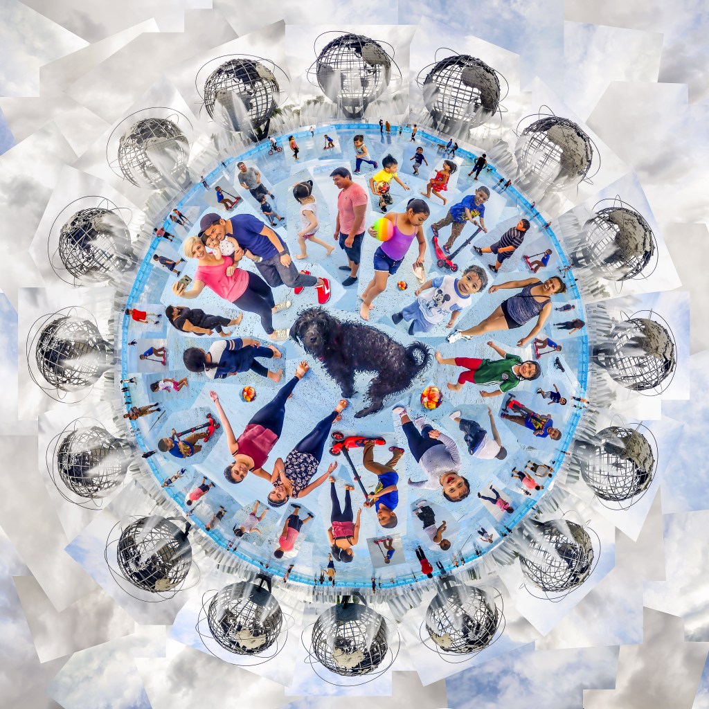
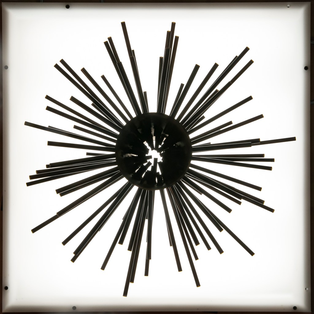
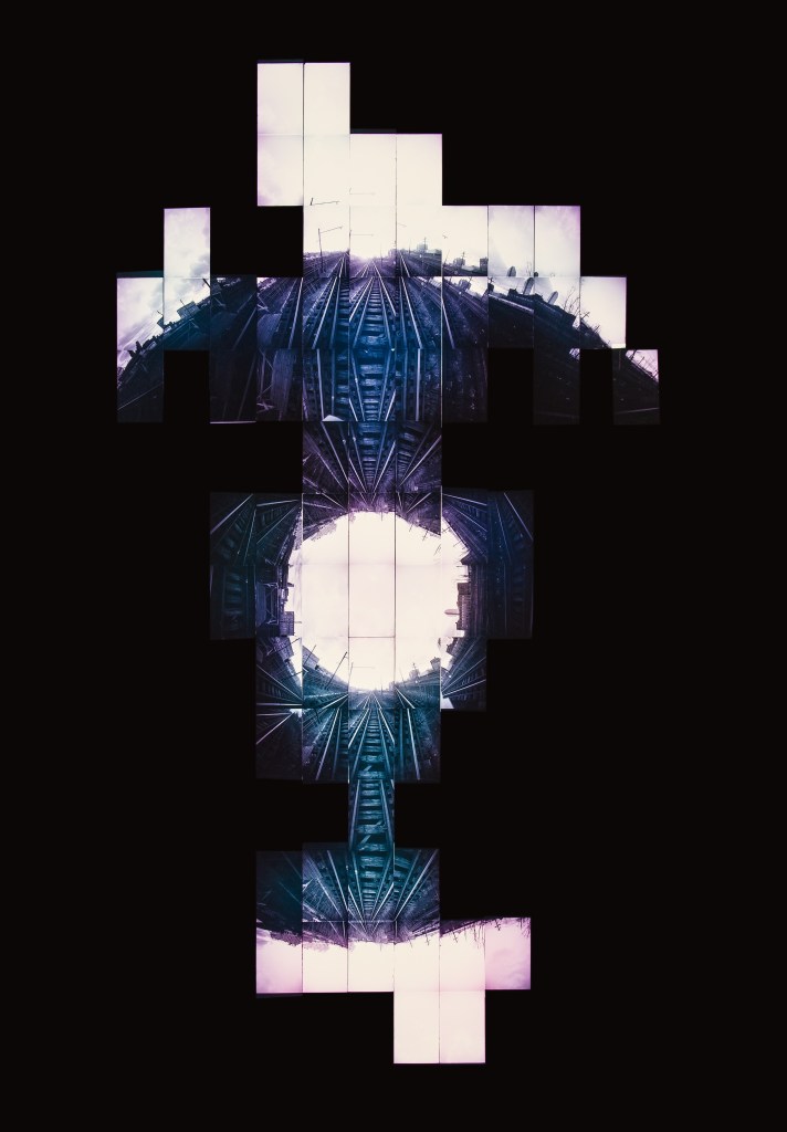
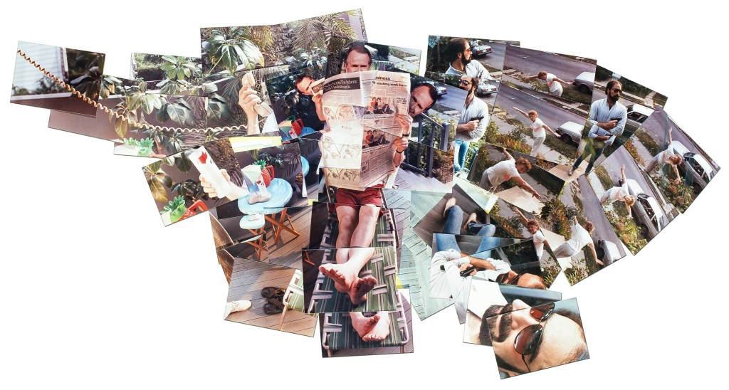
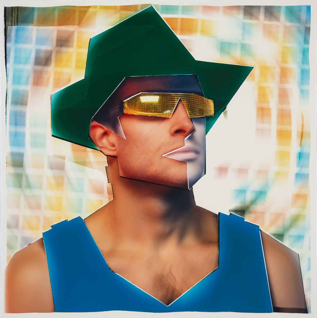
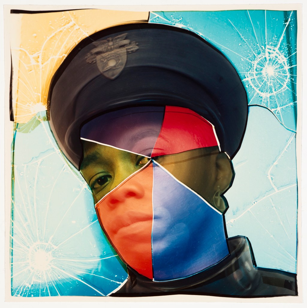
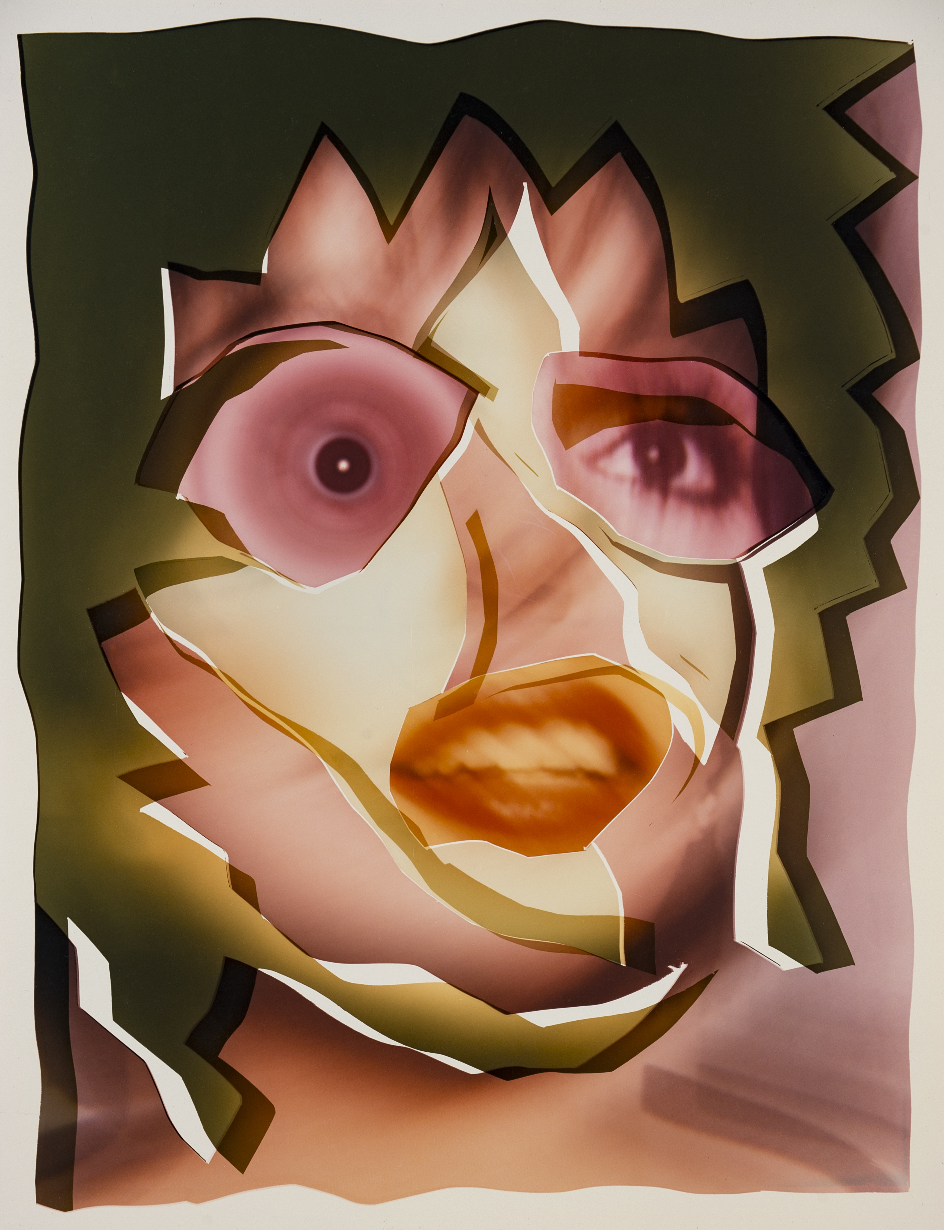
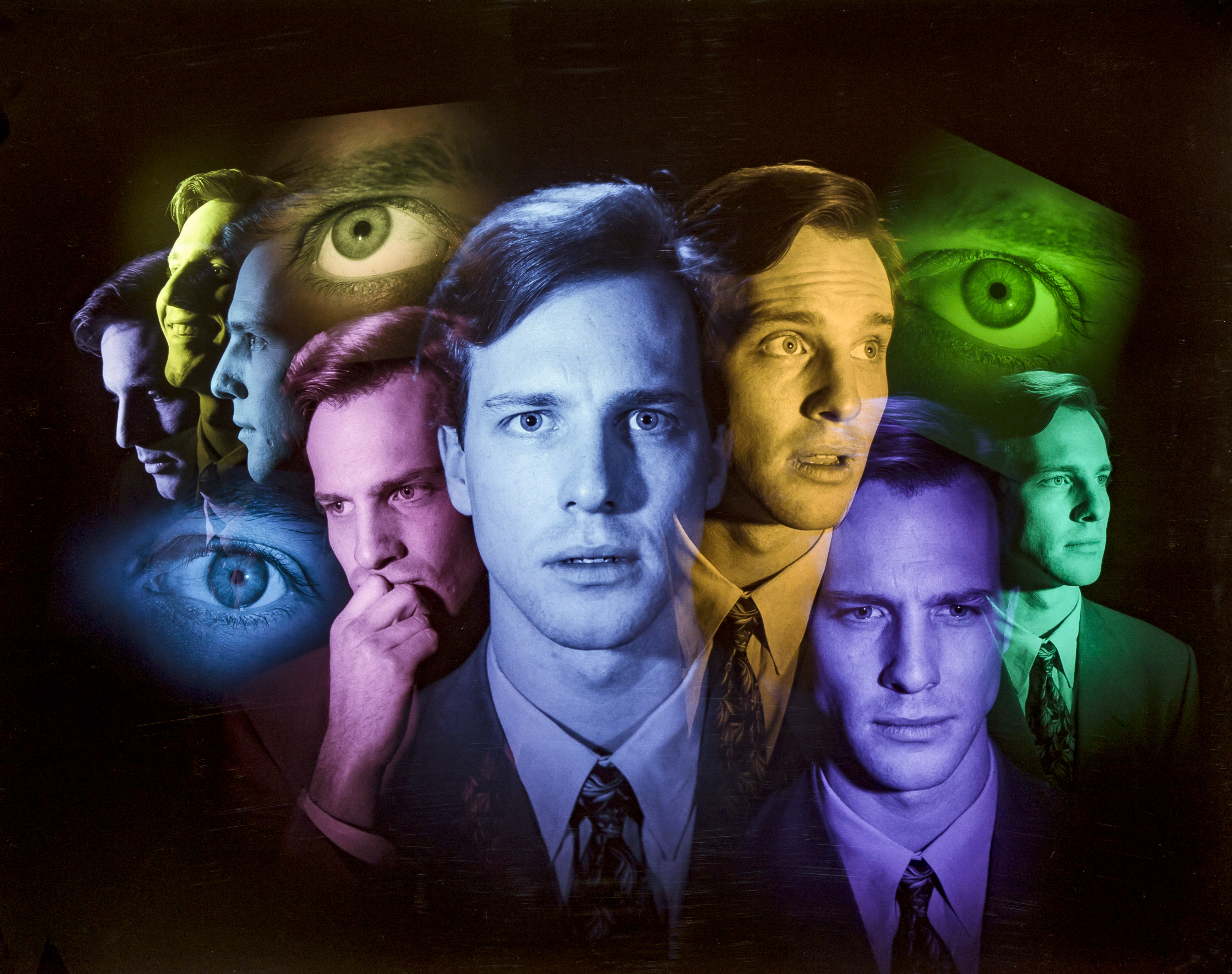
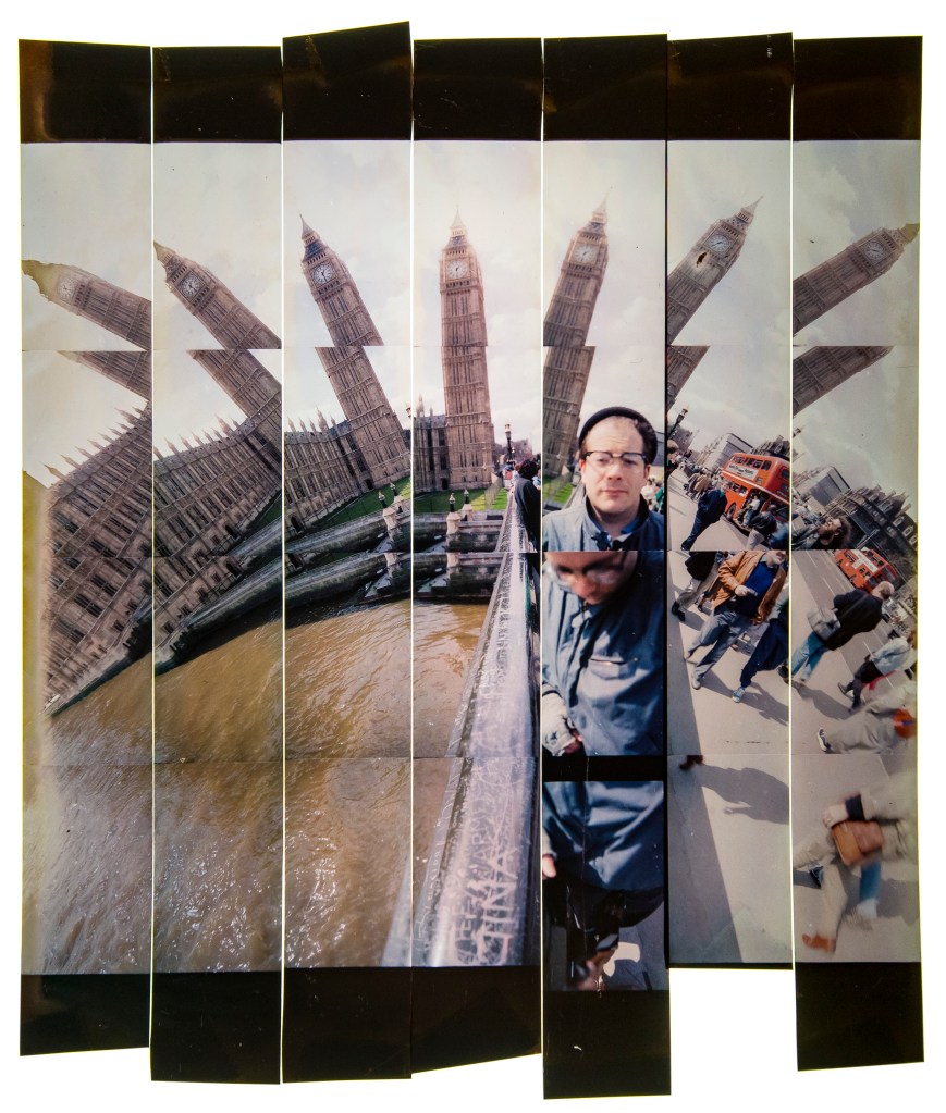
POLLMALL 2021 is a physical collage of strips of photographic film. The assembly, measuring app. 2×6”, was scanned at high resolution to make the final digital file. As of this date I haven’t actually printed it, but I envision it largish, 3’ x 9’ perhaps. We can dream, can’t we? The images are of various presidential candidates from the 1988 election, and were ‘leftovers’ from a rather peculiar job. This reimagined image is from the series ‘Working With Film’, one of 12 separate projects from the yearlong ’12 in 21’ adventure of 2021. 

Approximately 9,000 years ago when I was around 30, living in the loft in Astoria, and doing any kind of work that was photography related, I got contracted to manage a promotional project for the uncle of a former girlfriend, The Liberace of old school P.R., Ron Rubinow, of the esteemed Madison Avenue firm of Spencer and Rubinow. Funny thing, there never was a Spencer. Now that’s what I call P.R.! Think Yiddish, dress British as they used to say, before our children started telling us we couldn’t say anything anymore. I digress….

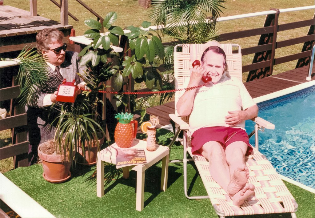
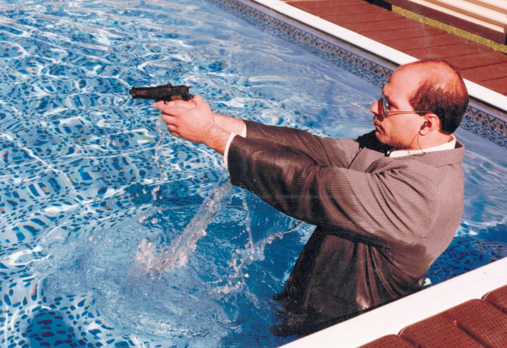
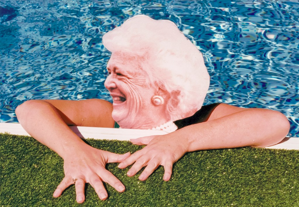
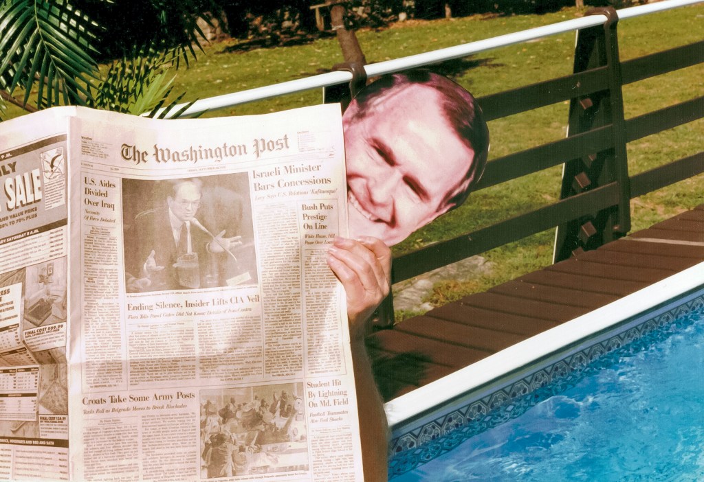
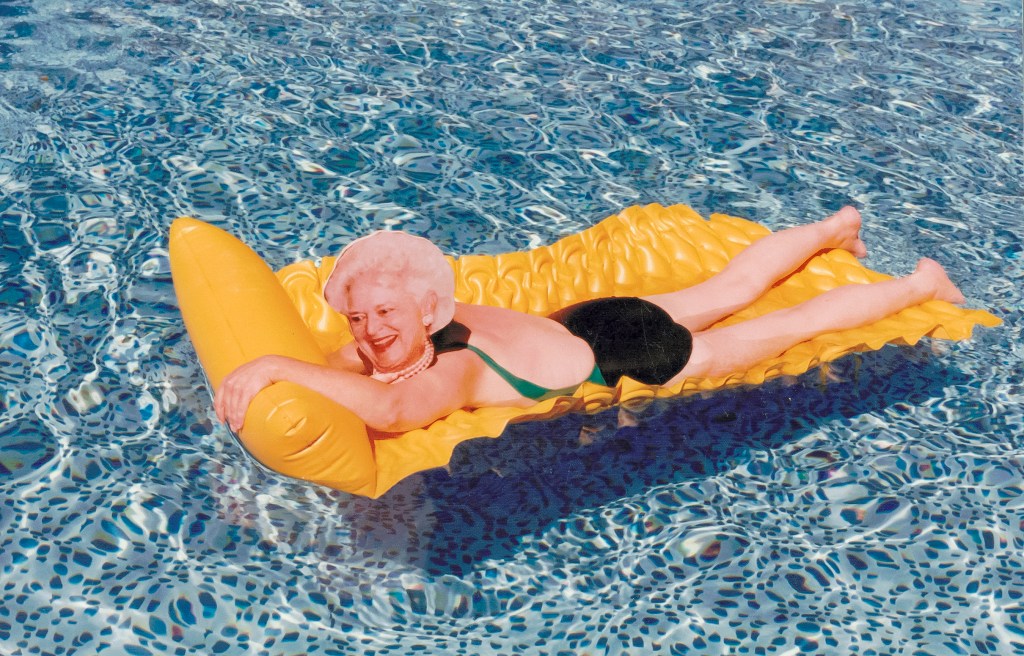
The project (actually the third for same client, the now defunct Greater New York Savings Bank) which happened during the nomination season leading up to the 1988 presidential election, involved standing in front of bank branches with full-size cut-out photographs of the various candidates vying for nominations including Pat Robertson, Jesse Jackson, Al Gore, GHWB, Michael Dukakis, Mario Cuomo, etc.  Bank clients (really, anyone walking by) were invited to have a Polaroid photo taken of themselves with the candidate of their choice. I was able to hire friends willing to suffer embarrassment for cash, and we did this for a number of weeks at different locations around the city. It was excruciating and hilarious. Somehow someone from Esquire Magazine spied us on the street and before long they were making arrangements to use the the cutouts in a fashion shoot. Oliver Stone’s ‘Wall Street’ had just come out and the models appeared to come from Yuppie Central Casting. 

Apart from a stack of polaroids, I had the 8×10” film copies of the candidates from which I had the giant prints made. They went into a box into the basement, along with trillions of other forgotten jobs from the pre-digital film era. I never throw anything away. I kinda felt, as digital was emerging, perhaps even this kind of crap could become more valuable in some modest way, if just because it was no longer being made.

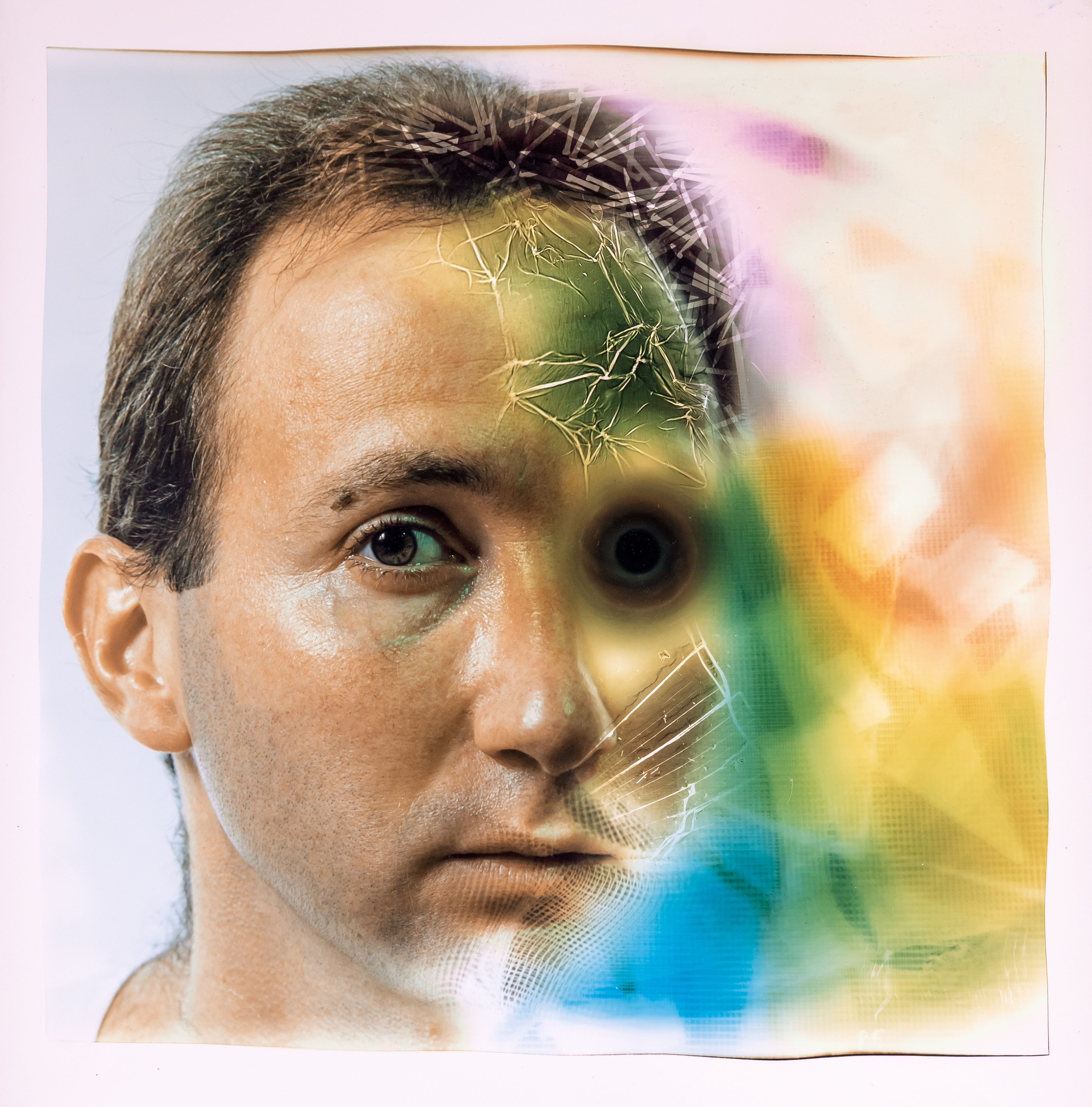
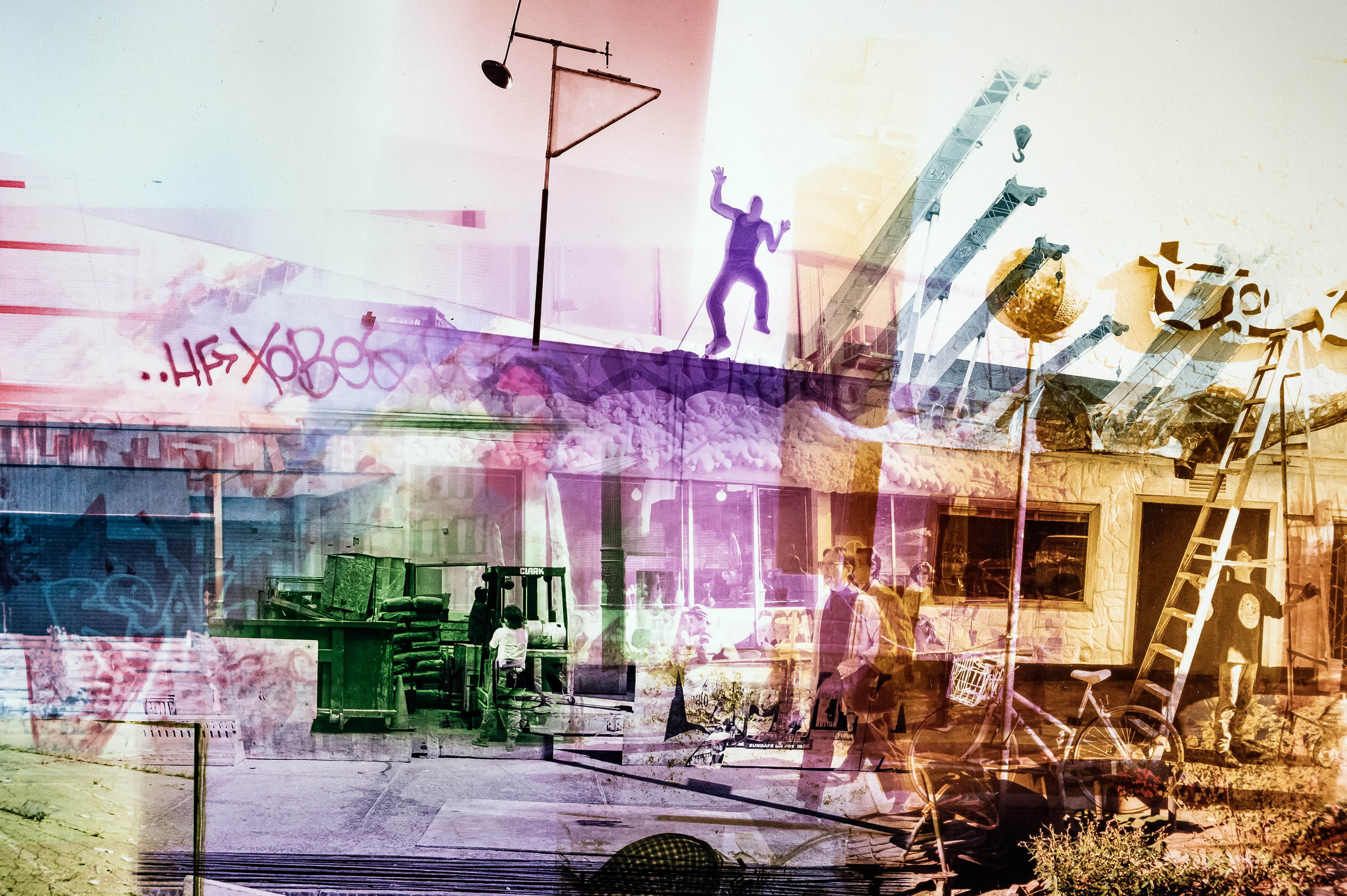
Enter my Covid-Era inspired 2021 ’12 in 21’ project where I sensibly soaked up much free time with a dozen self-diagnosed art projects. ‘Working With Film’ was one such project, and it involved (finally)  digging out all this old film and willfully desecrating into interesting visual solutions. 

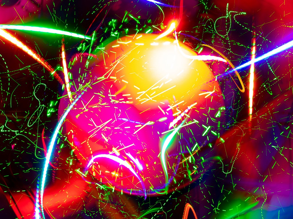
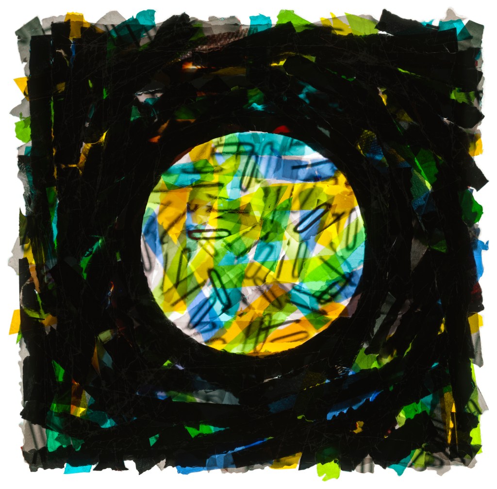
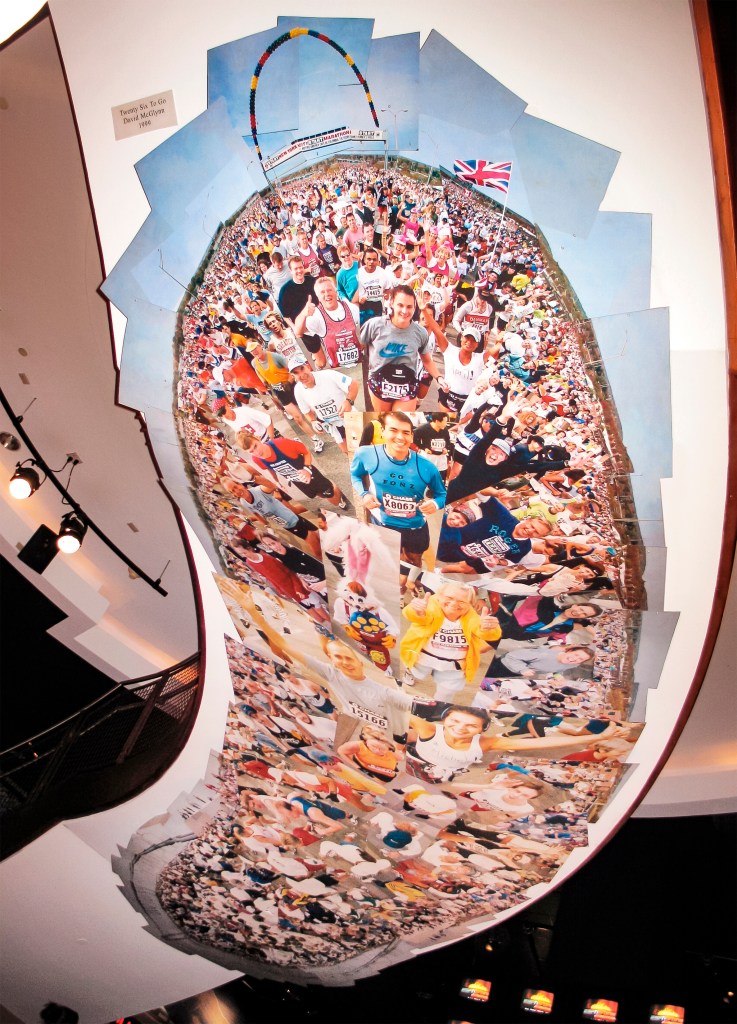
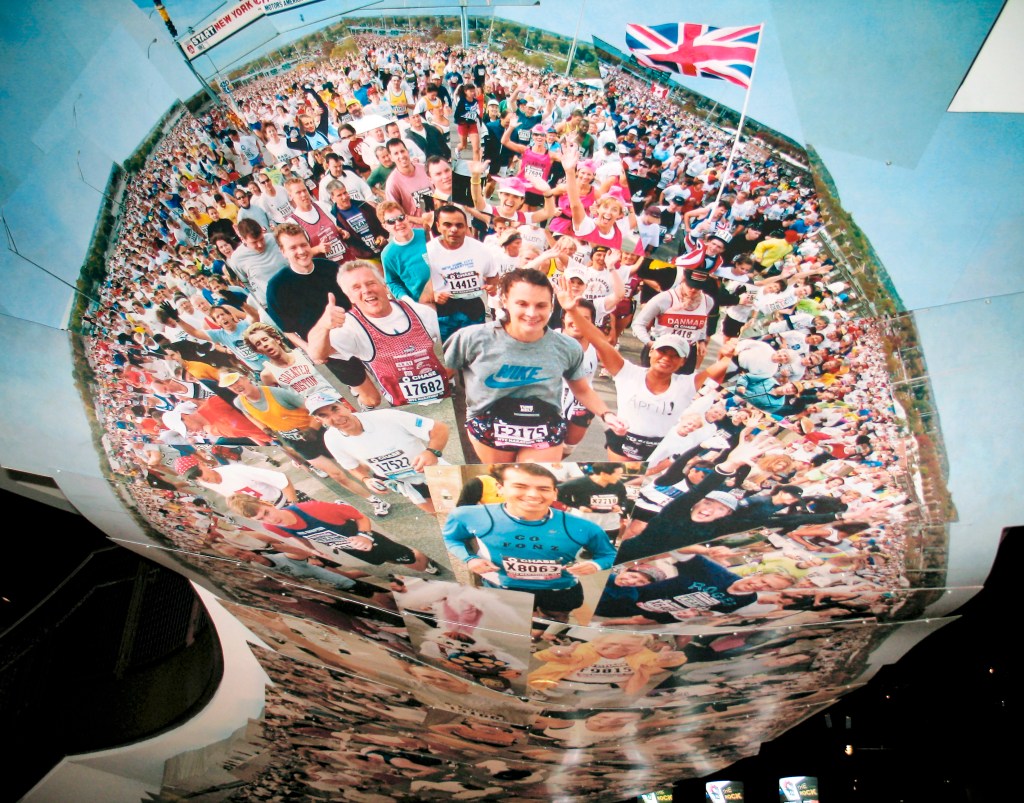
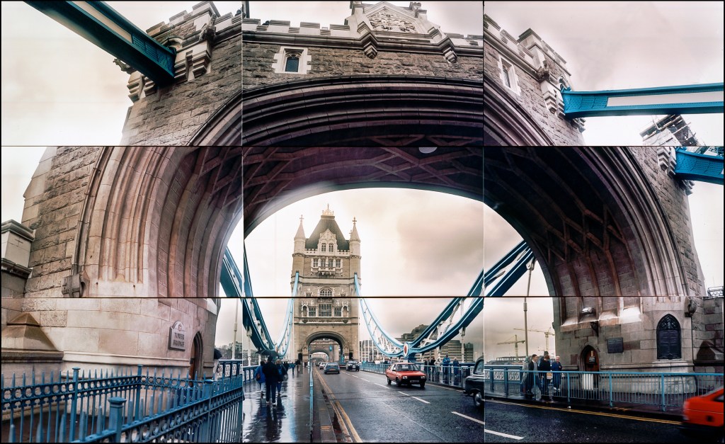
The Blurb: “Working With Film is the March 2021 installment of ’12 in 21’, a year-long series of month-long art/photography projects. It is an opportunity to delve into projects and interests usually pushed to the side. Most of the work is analog based. Visually, there is no set agenda, just energetic exploration allowing the process to inform and inspire. In this series I am working with old transparencies and negatives, mostly mine, mostly from old stock photo files. There is a smattering of ‘found film’ throughout… I am physically shredding film, using a hole punch, painting, freezing them in ice, and sandwiching between glass then smacking with a hammer, among other things. Jolly good fun! I am reassembling the scraps, then digitally scanning or re-photographing. There is minimal Photoshop.”

For this particular project I first took those 8×10” transparencies and gleefully put them thru a standard paper shedder. I then sifted the the debris and reassembled them in this ‘Frankenstein meets Picasso’ style collage.

As with a lot of my collage work, it sorta works like this: As modern painters shifted away from literal depictions on their canvasses and embraced impressionism, expressionism, surrealist and cubist styles, this immediately required a willing viewer’s brain to ‘do more work’ to sort out and make sense of these new visual approaches, in particular cubism. Much of it is unconscious; just as the brain makes sense of the stroboscopic moving images of film and television in order to become digestible and understandable (Film theorists often refer to this illusion of movement as the persistence of vision), there is a joyful dance going on in your mind when looking at (good, well made) non-literal art. This particular picture (if you can stand looking at it at all!) works in a similar if much coarser way. As you pass your eyes back and forth over the image your brain desires to make sense out of what it sees, and will start to glue bits together in the form of mutant pol mugs. Glorious!

CIRCULAR AND SPHERICAL MOTIFS IN MY WORK

For over 40 years I have been drawn to circular forms and formats in my photographic artwork, both in my photo collage and some creative still life work. In camera based photo collage it likely started with Boat, Cape Cod 1981,

BOAT, CAPE COD 1981 – 11″ X 14″ C Type Contact Print, Ed. 10

but has its roots in a mini collage from Rye Playland, made while at school in 1978.

But what exactly draws me to circular and (2-dimensional) spherical forms? Clearly I appear to love them, they show up over and over without much forethought. Is it because it is easy? Am I actually a lazy uncreative sot? I’ve found myself battling the urge, forcing myself to be more ‘compositional’ only to give in. Truly creative abstract composition which actually does something visually compelling is hard work. Truth be told, some of the collage concepts I develop are utterly reliant on the circle as part of the design and structure.

BODY BUILDER – Photo print collage – Client: Money Magazine

Others because…. I like circles. I love them and I hate them, that is. Never particularly good at self analysis, I decided to do some general WWW investigation. The first item in the first search: ‘The circle as a basic shape has always enchanted the human mind. Many mathematicians and philosophers considered it the most perfect of all geometric shapes, while theologians felt it supernatural or divine. For the artist the mysterious circle was always a thing of beauty and a joy forever.’ OK not bad, I feel mildly justified, if a little full of hot air. Lets dig further: Next, I found a link to a traveling exhibition entitled ‘First Circle – Circles in Art’ featuring works by artists including Franz Kline, Alexander Calder, Anish Kapoor, Richard Pousette-Dart. The shows highlights a quote from Ralph Waldo Emerson: “The eye is the first circle; the horizon which it forms is the second; and throughout nature this primary figure is repeated without end. It is the highest emblem in the cipher of the world.” I’m in good company, I’m thinking. Interspersed in the search results there’s a good amount about ‘perfect circles’ and who may have drawn them, but that’s not very useful or interesting. Then I came upon another artist (Monika Wright) confronting the same question about her own art, posting a useful summary of the symbology of circles written by Dixie Allan. Many interesting notes here, and one that stuck out was: ‘Circles were protective emblems to the Celtic mind. Circles were often drawn as protective boundaries, not to be crossed by enemy or evil forces’. Well I am of Celtic descent, and I am a Cancer, so that neurotic protective barrier notion sorta rings true. Anyway, I’m never comfortable trying to figure out why I make the art I do, I usually just end up with a fluffy layer cake of pseudo-intellectual B.S., so I think I’ll just toss the research in the trash can and just continue doing what I was doing and leave the interpretations up to the viewer…..

CHRISTO GATES – Digital photo collage – Client: Self promotion

OVERSIZE PRINTS AND INSTALLATIONS

In the early days of working with my composite panoramic collages, it became clear to me that some of these images were meant to be big. Alas, because they were originally created as large contact prints containing anywhere from 35 to 150 (later more) 35MM negatives, only some of the smaller assemblies would even fit into an 8×10 enlarger, which I didn’t have anyway. The solution was to make individual prints and assemble them somehow. In some cases I would dry mount prints onto oversize museum board, then frame the entire thing.

This was useful for corporate art sales and some shows. To make very large versions, I found a source for inexpensive lightweight black metal frames which would hold an individual mounted print of each frame of a collage, which I then assembled in vertical rows using long threaded rods. I had a metal hanging strip fabricated which I’d mount to a wall, upon which the rows would hang. I made a 6’ x 6’ version of ‘Untitled, Highland Lake’ in this manner.

In 1989, I contracted with AT&T’s corporate art department to produce a 9’ x 9’ version of ‘Boat, Cape Cod ‘ in the above manner for permanent installation in the Philip Johnson designed AT&T Headquarters building on Madison Avenue. I never managed to get a picture of it in place, but it hung there for years until SONY purchased the building, and my ‘Boat, Cape Cod’ sailed into the collection of the the New Britain Museum of American Art in Connecticut, where it lingers in storage presumably.

BOAT, CAPE COD 1981 – 11″ X 14″ C Type Contact Print, Ed. 10

In 1996 I was contracted by Corporate art company Randolph Tate to shoot and produce two collages for permanent mural installation in the Newscorp Headquarters on Sixth Avenue. These were collages of NY Jets and NY Rangers stadium games. For these, I evolved more of a ‘frieze’ approach, with the individual frames being printed and box-mounted at different sizes and depths. I have a few images here, but it does amaze me how few images I have of this kind of stuff from the pre-digital era……

In 1998 and again in 1999, I was contracted by ESPN ZONE / Disney to shoot, produce and install two site specific mural installations for the new ESPN ZONE restaurants opening in Baltimore and New York City. I was selected along with many esteemed artists and illustrators including Josh Gosfield and Steve Gerberich by curator/artist Steven Diamond, who managed the projects. For the Baltimore project I took a similar approach to the Newscorp project, this time the subject matter was the Preakness Race, the second jewel of the famed Triple Crown.

For the NYC ZONE, we chose the NYC Marathon as subject matter (after considering a possible NY Yankee ticker tape parade collage). We installed it on the underside of a curling staircase at the front entrance. The final collage, consisting of a couple hundred separate images, was broken out into 12 sections, each printed separately, then mounted onto sheet metal, then cut into their specific esoteric shapes. They were then installed as an overlapping ‘drop ceiling’, which could not have been done without the expertise of lifelong friend and union carpenter Michael Connor, who supervised the installation.

Tearsheet Time Capsule: Forbes FYI Magazine – 1991

Right up until this assignment I had pretty much steadfastly avoided doing any ‘David Hockney patchwork style’ photo collages. Apart from the fact that it simply wasn’t my thing, I was still sorta smarting from the constant comparisons while doing my own work. (for more info on that moment, please see: https://davidmcglynn.com/2023/04/27/tearsheet-time-capsule-brooklyn-bridge-postcard-1982/) Then… I was selected by esteemed art director Alexander Isley along with a group of fine illustrators to be part of a political homage/parody article wherein we were all asked to do portraits of then president George Bush in different famous artists styles. I was asked to mimic the style of David Hockney. For a few seconds I bristled, then realized this was exactly what I needed to do – to crack thru my self imposed stylistic exile, and because… it actually looked like a fun thing to do.  We came up with an outdoor pool related concept as this was/is a big theme of Hockney’s work. ‘Poolitical Couple’ – George and Barbara Bush poolside was born.

At this point in time I was routinely asking friends and family to step in as models for assignments (cheaper by the cousins!) and this job was no exception. On top of that, we photographed it at my brother Willy’s pool at his home in Putnam Valley NY. As part of the sketch phase, I went up to my parent’s house in the Bronx, and hustled them and my friend Angelo from across the street for some pretty funny tests.

FORBES SKETCH 1991
FORBES MINI SKETCHES 1991

I was very excited about the idea of creating an image with GHWB clipping his toenails, but it didn’t fly. That’s OK, we’d get the last laugh in what was already a pretty hilarious endeavor. I created some comical cut-out prints of George and Barbara’s faces for added realism….. For the final shoot we had my father as GHWB, my cousin Kathleen McGlynn (RIP) as Barbara, and my Brother Willy and brother in-law Joey as ‘secret service’ agents.  I should note at this point the plan for the original art after publication was to present it all to the Bush White House as a gift from Forbes. I was so very on board with that because…. brother William, God bless his departed soul, was a reasonably good marijuana cultivator, and though it was early in the season, we were able to sneak a small plant into the picturenext to olde George.

We were VERY excited at the prospect of having a photograph of a pot plant next to GHWB hanging somewhere IN THE WHITE HOUSE. As it turned out that never happened, but it did hang in the Forbes Gallery on Fifth Avenue for years. On top of being one of the most fun assignment experiences, and one of the funniest collages I’ve ever made, it did open up the floodgates of future patchwork collage making, because, as it turns out, the only one who really cared was me. Let go those self imposed shackles! I probably saved oodles in therapy costs as well.

Tearsheet Time Capsule: American Health – 1989

By the time I received this assignment for American Health Magazine in 1989, I had more or less mastered creating little ‘planetoid’ collages within my composite panoramic style, the first one being ‘Boat, Cape Cod’ which I had photographed in Wellfleet in 1981. Prior to this, I was creating very regimented 180/360 gridded panoramic collages using my special device on a tripod. The boat image, composed of 9 strips of 6-35MM frames each, was done ‘freehand’, wherein I sought to create essentially a fisheye view in sections. The challenge, while shooting so many frames, was keeping track in my head of where I was within the overall design. Working without a plan, I did pretty well, and always enjoyed the imperfections. I made a slew of these planetoid pictures over the years. For this assignment I changed it up by turning the design inside out. On top of that, I worked off of a sketch to ensure the creation of a tight circular form. I was getting paid after all. It was an environmental piece and I sought to make it all about sky.

I photographed it in the fields on the campus of my alma mater, SUNY Purchase College, using olde pal Jerald Frampton as model. As it turns out the boat image wasn’t the first planet shape collage I had ever made.

BOAT, CAPE COD 1981 – 11″ X 14″ C Type Contact Print, Ed. 10

I found this sketch from a student project on panoramics, a foreshadowing of my future photography endeavors. Over the next few years I returned to this same grassy field to do more collage assignments, including the last two shown here.

BODY BUILDER – Photo print collage – Client: Money Magazine

Tearsheet Time Capsule: Interview Magazine – 1989

As I made the all-important discovery that my gridded panoramic photo collages had genuine limitations for usage on the commercial assignment side of things (magazines, corporate, advertising, etc.) I began devising some styles and approaches based on other photo experiments I was doing. I was always a little squeamish about the vibrant collective warning against ‘selling out’ that was popular amongst the young idealistic arteest set, even if it was a little vague. It took a little while to realize how no one actually gave a shit – it was an adorably constructed phantom value I adhered to, like many. If Picasso managed to find himself doing a painting for the cover of IBM’s Annual Report, I’m sure that painting would still fetch 50 million bucks today. (I suddenly smell a raft of letters to the editor…)  Anyway, I felt better leaving my gridded collage work unscathed over in my fine art production side.  I was moving quickly thru styles at this moment in time, sometimes inviting an art director or photo editor to take a chance on an experimental approach. Those poor fools. I must make amends someday. Yep, sometimes it all worked, sometimes, not so much.  Thankfully I kept my feet moving.  For this Interview Magazine assignment I had the privilege of photographing the emerging house band Kraze, who had the hit song ‘The Party’ playing at those deep-house clubs in the 80s. They were awfully nice, but I could tell they were a little nervous; this is not a photo shoot they were accustomed to, coming out to our strange loft in Astoria Queens, no typical hair, make up, wardrobe, catering, just me and my rickety homemade lighting arrangements and weird music. They had that look of bewilderment, like they were wandering around an airport in a foreign country.  At one point the lead singer just gently leaned in and said. “ please – just make us look good“.  For these photos I was shooting in color film, and doing my special stencil easel treatments under the enlarger, which I have subsequently categorized as ‘Proto – Photoshop’. I do like the way the Interview art director arranged the four individual portraits, thank God, because the group photo was kind of a fail. The joy of flying by the seat of one’s pants.

KRAZE I 1989
KRAZE 3
KRAZE 2 1989

The Olde Dome

In the early 80s I attended a performance by Laurie Anderson in the then decrepit plaza of the New York State Pavilion at the site of the old 1964 World’s Fair in Flushing. She stepped up to the microphone gazing around and said “Wow, so this is what the future looks like 25 years later“. Recently I had the opportunity to visit Buckminster Fuller‘s geodesic dome in Woods Hole Massachusetts, abandoned and in utter disarray.

On the property, a new development springing up, the piles of earth pushed towards this now crumbling signifier of a bright and shiny future. So this is what the future looks like 70 years later. The dome was built in 1953, commissioned by a local restauranteur, and was Fuller’s first attempt at building the unique structure he developed. His general vision for geodesic domes was ambitious – he felt certain he could solve building and housing shortages with these domes which needed significantly less materials to build. The Dome Restaurant was regarded as an incongruous eyesore to some in the neighborhood, alas it was a very popular place for those seeking its novelty, and it thrived into the 80’s. As it turned out, it was a leaky affair and a heat trap as well. The future at 30 years…. After decades of neglect, new owners wanted to bulldoze this piece of history to make way for development, but neighborhood outcry secured a deal where they will not only keep but restore the dome. Even so, the plans and the dome’s exact future are not clear as of today.

Back in the early days of working with my composite panoramic photography I envisioned making 3D environmental wraparound panoramic photographs, a precursor to QTVR, the kind of photographic experience you can now do with an app on your phone. I was using Bucky’s domes as direct inspiration. I guess I’ve been a fan for a while; I made a few of Bucky’s ‘Tensegrities’ (tension-integrity) sculptures while in school. Riffing on the dome but eventually settling on a Mercator-projection style solution which was more fitting for how I was creating these panoramics, I made a few mock ups, including a reasonably large one which I did have in a show in the 80’s.

POOL, CAPE COD SPHERE 1979-1982
BROOKLYN BRIDGE GLOBE MAQUETTE 1982

Coincidentally, on that otherwise lovely drive I had been listening to the book ‘Bittersweet – How Sorrow and Longing Make Us Whole’ by Susan Cain which my sister Tracy recommended. It’s a great book. As part of the author’s journey she talks a lot about the soothing power of melancholic music and lyrics and her absolute favorite artist in this vein is Leonard Cohen. A line from one of my favorite Leonard Cohen songs ‘Last Year’s Man’ popped into my head as I tried to reconcile the sadness of seeing this important monument falling apart, its future uncertain. “All the rain falls down Amen, on the work of last year man” I give my first impulse to save it some credence, “No, not the bulldozers! Something must be done to save this structure, this piece of history!” But why and for how long? I relax and realize it will be OK either way; I’ve learned a thing or two about impermanence over the years. All the same, right now it would be a helluva place to hold your next rave.

Proto-Photoshop

Analog Photo Projects Before the Computer Age

For a long time when people would ask me how and why I started making photo collages, I found myself spinning elaborate stories of my ‘dissatisfaction with the static nature of the single image’ and ‘a desire to express a feeling of time and motion, and not simply capturing an instant in time’. This was usually during interviews conducted by magazine editors who needed space-filling words. I could spew with the best of them but in hindsight I believe I was simply signaling my youthful attitude toward the ‘decisive moment’ crowd and the likes of straight, formal photographers such as Ansel Adams, etc. I ran with a snarky art-punk crowd, and I was insufferable. The fact is, right from the outset I was simply using various camera techniques as tools to make artful images, pushing limits of long exposure, motion blur, multi flash, multi exposure, drag shutter etc. and those techniques simply revealed themselves as creative solutions on the fly, and, well, it all pleased me. Collage came naturally on this kind of path. So did this body of work which I now call Proto-Photoshop. So named, because it was all done before art-making was available on computers. After the advent of computer art and Photoshop, people would look back at this work and say: “I guess you made this in Photoshop?” We called it photo-illustration back then. 

KRAZE 3

In this grouping there are a few collages, drag shutter and long-exposure motion images, but the bulk are essentially multiple image prints made in the darkroom. Most were created for commercial assignments in the 80’s and 90’s. Some are color negative film printed on C-type paper,

others are black & white reversal film printed on Cibachrome paper.

MADEMOISELLE 1992

The color shifts were created using the enlarger.  Some are straightforward multiple image prints.

ROOTS OF RACISM I for NEW WOMAN 1992

In some cases I made sectioned stencils and exposed each area separately, treating each with its own color and tone, sometimes adding a ‘spin’ to the easel to create motion, sometimes adding a physical stencil like a window screen, broken glass, etc. to create effects.

MARK LEYNOR 1990
KRAZE I 1989

Some of the exposures took several minutes to execute; I would use a cassette tape of pre-recorded instructions to help in the dark. This in addition to some thorough planning and sketching before the actual shoots. Some of the effects were photographed ahead, some created in the darkroom.

GLAMOUR CIBACHROME 1993

A particularly proud moment was photographing the woman floating in milk by cutting holes for her hands and head out of a large piece of white board, and printing that into the final image.

Whew, today that would take 5 minutes in Photoshop.  It is safe to say when Photoshop came along, I was ready. I didn’t take to it right away, however.  In fact, I worked extensively for WIRED magazine late into the 90’s, even had a spot on the masthead as a contributing artist, and I never did any digital work for them.

WIRED 1.1 1993

In fact, when I did Absolut McGlynn (along with a group of WIRED artists), I did my usual analog print collage. That year I entered it into the Graphis Photography Annual.

I won placement… but in the relatively new Graphis Digital Annual. I had to let them know it was analog art, and they said: “Oh damn. Well, um, can we put in the digital edition anyway??”  I said yes of course, as that strange secret act appealed to my subversive nature.  A few years later I started using Photoshop. 

Tearsheet Time Capsule: Traveler Magazine – 1988

In early Summer of 1988 I was working in what would be my last restaurant job, at An American Place with James Beard award winner and pioneer of the new American cuisine Larry Forgione. I was extremely lucky to have worked at 2, 3, and 4 star restaurants in NYC during my 80’s waitstaff reign of terror. But I was done. Conde Nast’s Traveler Magazine was putting together photographers for a special London issue and I was in consideration thanks to friend and photo editor Kathleen Klech, who thought, though untested, I could be an interesting part of the mix, which was a group of considerably more experienced and seasoned travel photographers. After all, I was doing these interesting photo collage thingies. I had firmly decided that if I get this job, I’d go full-time freelance and never look back. I can vividly remember calling her from the payphone in the coat room every two hours for what must have been a pretty annoying stretch. When maybe turned yes, I gave notice, and off to London we went. We spent approximately a week there, me wandering about making photo collages during the day, then meeting up with the gang at night at restaurants and bars of London, all in all having a fabulous time. It became abundantly clear this was the more desirable employment scenario. While there I made over a dozen different collages, a handful of 3×3’s, some diptychs, some panoramic strips, etc. Back in NYC, I put together the various projects, and excitedly submitted them, and impatiently waited….. for the issue to come out…. to find that they only used a few frames extracted from one of the collages.

Crestfallen, all I could think of was the Star-Kist tuna commercials of the 70’s – ’Sorry Charlie, Star-Kist don’t want tunas with good taste, Star-Kist wants tunas that taste good’. What was I thinking? What were they thinking?? I really loved some of the images I made while there (some are attached here), alas, travel photography they are not. Having had plenty of photo jobs under my belt by this time, I was already reasonably jaded, so I took it all on the chin. No matter, I was launched. And I never looked back!

BIG BEN 1988

TOWER BRIDGE 1988
PICCADILLY 1988
LLOYDS OF LONDON 1988 – 16″ X 20″ C Type Contact Print, Ed. 10
TOWER BRIDGE 1988 – 11″ X 14″ C Type Contact Print, Ed. 10
BIG BEN TEST 1988

Tearsheet Time Capsule: Avenue Magazine – 1988

Right on the brink of my commitment to working full-time in assignment photography 100%, I contracted this job with Avenue Magazine. I had a few jobs under my belt already where I had applied my fine art photo collage style to commercial ventures. It was not always a comfortable or sensible fit. That is to say, where the solutions would often work, I still felt slightly like a…. sellout? Those feelings would go away upon close inspection whereupon I would discover that absolutely no one cared about this except for myself….  I forget exactly why we chose black and white, but it looks good to me now.  Avenue was then still in print, now it is online. It is a very highbrow lifestyle magazine appealing to the happy healthy affluent elite of NYC, who were absolutely brimming with wealth in the Eighties. What better topic for the magazine than an article about wealthy rare tree collectors living in the East Hamptons. I had a particularly fun time photographing the late Mr. Alfonso Ossorio, heir to the Domino sugar fortune, an artist who owned a wee 60 acre estate in the Creeks in the Hamptons with his partner Ted Dragon, at a time when a single acre would fetch around 9 trillion bucks. He couldn’t have been any more cordial and interesting, showing me not only his collection of trees, but his art and sculptures which were all over the grounds.

OSSORIO 1988
AVENUE MAGAZINE TREE COLLECTORS 1988

I was fortunate enough to visit him again along with olde pal Jerald Frampton, at which time I created a handful of collages, including some new 3X3 format collages I’d been experimenting with, some of which can be seen here. As for the tearsheet, I think I only ever received one copy, and cannibalized it for the portfolio, so only half is visible here. Also here is an example of Mr. Ossorio’s assemblage work (or as he preferred to call them: ‘Congregations’) 

OSSORIO POOL 1988